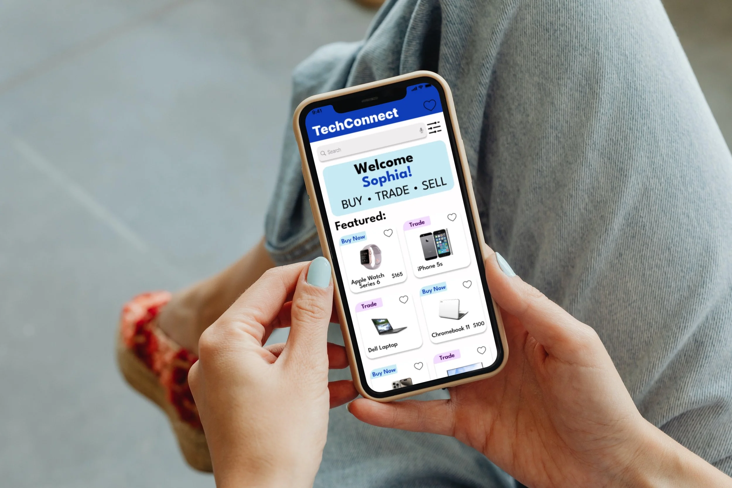
TechConnect buy, sell, and trade technology at affordable prices.
TEAM
Sam Popek, Evan Cassell, Andrew Hlade, and Landon Garth
SKILLS
User Experience Design, Interviews, Primary and Secondary Research, Affinity Mapping, Card Sorting, Prototyping, and Visual Design.
TOOLS USED
Miro and Figma
WHAT I DID
TIMELINE
I conducted interviews with students and individuals experiencing financial challenges to grasp their needs. I conceptualized and advocated for diverse features, emphasizing analytics screens. I actively contributed to the design of the final prototype and the visual design of various features, all aimed at creating an immersive and user-friendly experience.
OVERVIEW
Sep 2023 - Nov 2023
TechConnect, a buy, trade, and sell app, is dedicated to empowering underserved communities and individuals facing financial constraints by providing affordable access to technology. This platform allows users to purchase technology devices at significantly reduced prices through selling their own devices or engaging in community-based trades. Our primary goal is to broaden opportunities, granting users access to affordable technology unlocks doors to health, education, and career possibilities. By overcoming the barriers of full retail prices, TechConnect stands as a gateway for positive change, fostering a community-driven marketplace that opens new pathways to a brighter and more inclusive digital future.
BACKGROUND
UN Goal team is addressing
No Poverty > By 2030, ensure that all men and women, in particular the poor and the vulnerable, have equal rights to economic resources, as well as access to basic services, ownership and control over land and other forms of property, inheritance, natural resources, appropriate new technology and financial service.
Specific topic within this UN Goal we are addressing:
Technology allows individuals to have access to resources and education that enhance their quality of life, but residents in rural communities who lack access to technological advancements, fall behind in the opportunities that these technologies provide. This widens the gap between rural and urban communities, thus increasing poverty. Therefore, it is critical to implement a plan to make technology easily available for individuals to improve their overall quality of life.
Objective
Create an application that allows a community where users can buy, sell, and trade technologies at affordable prices.
Give users a filter system that provides technology options based on their specific needs of said technology.
Recycle unused to technologies from institutions and redistribute to applications users at affordable prices.
How This Fits into the UN Goal:
This relates to the UN goal by providing people in rural or impoverished areas with more access to affordable technologies which brings more opportunities for people to utilize the offered technology and break out of the cycle of poverty.
Design Process
EMPATHISE
Focus Groups
Centering our efforts on the UN goal of eradicating poverty, our primary target audience was initially students in rural communities. As the project unfolded, we broadened our focus to include individuals experiencing financial hardships and those in impoverished communities. This expansion allowed us to capture a more comprehensive perspective and better address the diverse challenges related to poverty, ensuring our solutions were inclusive and impactful for a wider range of users.
Financial Hardships
Students
Impoverished Communities
User Interviews
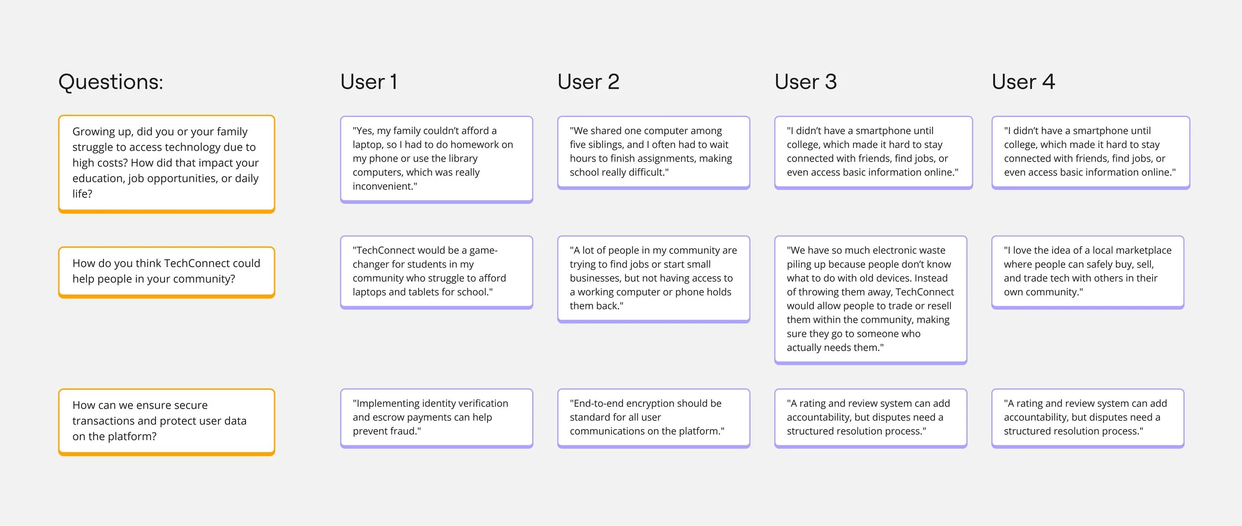
As a team, we conducted research by interviewing four students who grew up in impoverished communities and faced significant challenges in obtaining technology. They shared their personal experiences, highlighting how limited access to devices impacted their education, job opportunities, and daily life. We discussed TechConnect with them, exploring how a community-driven buy, sell, and trade platform could bridge the digital divide by providing affordable access to essential technology.
Have a look below to see few of the responses we received:
We developed our questions by identifying key challenges in technology accessibility and crafting open-ended questions to gather meaningful insights.
DEFINE
Affinity Diagram
To better understand our user group and their needs, we conducted an in-depth analysis of four interviews. These interviews provided us with a wealth of qualitative data, which we meticulously examined to extract meaningful insights. By listening carefully to the experiences and perspectives shared by participants, we were able to identify patterns and trends that shed light on their expectations, challenges, and goals.
To organize the data effectively, we grouped the findings into larger categories based on recurring issues and themes. This process allowed us to uncover commonalities across participants, highlighting shared needs, priorities, and pain points. By breaking down the data in this way, we gained a clearer understanding of the user group as a whole, ensuring that we could address their most pressing concerns in our design.
Sticky Notes:
Main Topics - Pink
Topic Description - Green
Participant Responses - Participant 1, Participant 2, Participant 3, Participant 4
Personas
As a team, we developed two detailed personas and created two task-based scenarios to clearly define and represent the individuals we had researched. These personas were meticulously crafted to reflect the behaviors, goals, and pain points of our target audience. Through extensive research and analysis, we aimed to ensure that each persona provided an authentic and relatable depiction of our users. Moreover, the personas acted as reference points during critical phases of the development process, guiding discussions, prioritizing features, and validating design choices. They helped us remain focused on solving real problems for our users and maintaining a cohesive vision for the project.
Have a look below to explore our detailed personas, which were key to shaping our approach and delivering meaningful solutions:
Have a look below to see our tasked based scenarios:
IDEATE
Card Sorting Study
We used this UX research method to understand how individuals perceive and categorize information, particularly through our in-class card sorting activity. It was fascinating to watch our classmates decide which cards fit into which categories, offering a firsthand look at their thought processes. Each participant brought a unique perspective—some even suggested new categories on sticky notes, believing they better suited specific cards. Observing the variety in how people grouped the cards provided valuable insights and helped us gauge whether our app’s purpose was communicated clearly. This exercise was crucial for my team and me, as it guided us in determining the most logical and user-friendly way to organize information in our prototype. My thought process was focused on identifying patterns in user behavior and using these findings to shape our app’s design. Overall, the positive feedback and the fresh ideas from this activity reinforced our design direction and validated the potential of our project.
Have a look below to see the results of our card sorting activity:
Optimal Card Sorting
For this method, I conducted an online card sorting survey with over 20 participants. Each participant was presented with a set of cards, each representing a piece of content or information, and was asked to group or categorize them based on their understanding and perceptions. The goal of this "optimal" card sorting approach was to discover the most efficient and user-friendly way to organize information by tapping into users' mental models and preferences.
The input from this survey was incredibly valuable. By analyzing how participants grouped the cards, I was able to identify clear category structures and determine which categories were most important to users. This data played a crucial role in helping my team and me organize information logically and effectively as we moved into the next phase of our project. The insights gained provided a strong foundation for creating a more intuitive and user-focused design, ensuring our prototype aligned well with real user expectations.
The insights gained from optimal card sorting are pictured below here:
This view above shows how each card was categorized by our participants. You can see at a glance which cards were most commonly sorted into similar categories and which were split across different categories. This helped us to identify where our participants agreed, where they have different ideas and potentially if there were card labels that they didn’t understand.
Above is the similarity matrix, it views the proportion of our participants who grouped any 2 cards in the same category. For each pair of cards, the intersecting cell shows the percentage of participants who grouped these cards together. We cluster the most closely related pairings along the right edge of the table. The darker clusters are great starting point to identify potential groupings.
DESIGN
Low-Fidelity Prototypes
Filter Page: I was tasked in designing the low fidelity filter prototype that demonstrate the user's capability to click and efficiently sort through technology devices by specifying criteria such as condition, value, location, date, and model. A notable addition to the filter is the incorporation of a "Trade Only" button and a "Buy Now" button, enabling users to easily indicate whether they are exclusively interested in trading, purchasing, or both.
Sorting and Filtering:
Technology Device: Users can specify the type of technology device they are looking for (e.g., smartphones, laptops, tablets).
Condition: Users can filter devices based on their condition (e.g., new, used, refurbished).
Value: Users may set a price range or value range for the devices they are interested in.
Location: Users can filter devices based on their location, which could be useful for local transactions or pickup options.
Date and Model: Users can further refine their search based on the device model and the listing date.
Trade-Only Button:
This button allows users to indicate that they are interested only in trading their current device for another, rather than making a purchase.
Buy Now Button:
This button is for users who are specifically looking to make a purchase and are not interested in trading. It streamlines the process for buyers who want a quick and straightforward transaction.
Buy Page
Trade Page
Filter Page
These features collectively provide a flexible and customizable search experience for users, catering to different preferences and intentions. It's important to ensure that the user interface remains intuitive and user-friendly so that users can easily navigate and make their selections. Additionally, incorporating clear and concise labels for each filter option and button will enhance usability. Regular user testing and feedback can help refine and improve the interface based on actual user experiences.
Here are the remaining low-fidelity prototypes created by my fellow team members. We collaborated to explore user-friendly designs and determine the layout for optimal accessibility and user-friendliness. Our central aim was to ensure the site's readability and accessibility were clear, clean, and professionally presented, facilitating easy navigation for users. Additionally, we incorporated numerous adjustments based on in-person feedback from classmates to enhance user satisfaction.
Sell Form Page
TEST
Final Prototypes
Our project is closely related to our original UN Goal which was no poverty, we put our focus on finding a way to provide technology to impoverished communities because we are aware of how much opportunity can arise with access to technology. The first method we practiced was contextual inquiry where we learned that the areas we should focus on are inner cities and rural communities. This was an important change that broadened the scope of our project. The next method we practiced was web scraping. We scraped subreddits to gather data and then categorize it. Throughout these first two methods, we were also creating personas and task-based scenarios to help define our target demographic for this project. The method that was most relevant to our wireframes was the card sorting activity. We had participants sort different elements of a website into categories that they thought were the most accurate. This data helped us decide how to structure and organize the final iterations of our wireframes.
Big Points:
TechConnect serves as a gateway, providing users from impoverished communities and those facing financial constraints with affordable access to technology. This access opens doors to improved health, education, and career possibilities, emphasizing the app's commitment to fostering positive social impact.
One of the key features of TechConnect is its emphasis on community engagement. Users can seamlessly connect with fellow community members to trade technology devices at fair and mutually beneficial prices, fostering a collaborative and supportive environment.
Ensuring trust and reliability, TechConnect verifies the authenticity of every tech device listed on the app. This commitment to authentication enhances the overall safety and credibility of the platform, assuring users of the quality of the devices they buy, sell, or trade.
By enabling users to buy, sell, and trade technology devices at reduced prices, TechConnect actively promotes affordability and inclusivity. The app strives to break down financial barriers, making technology more accessible to a broader demographic.
Acknowledging the importance of affordable technology access to impoverished communities, the app not only addresses a fundamental need but also positions itself as a driving force in the journey towards digital equality.
Have a look below to see the final prototype:
Usability Testing
Usability testing with users from our target audience were done in-person to assess the app's intuitiveness and ease of use. Participants completed tasks using our prototype, and we observed their interactions, focusing on navigation and clarity. After each session, follow-up interviews gathered feedback on challenges and suggestions for improvement. This testing helped us refine the design, enhancing functionality and user experience.
Reflection
This project taught me the importance of design as an evolving process that thrives on continuous feedback and adaptability. Effective communication was crucial, not only within our team but also in understanding and acting on user feedback. I learned that designing human-centered products requires empathy, collaboration, and a willingness to adjust based on user challenges. The experience deepened my understanding of how these elements come together to create solutions that truly meet user needs.
Conclusion
We followed an iterative design process, gathering feedback to refine the prototype based on user input. By focusing on user needs, we identified key areas for improvement, such as navigation, the sell form page, and performance. This process helped enhance the app’s usability, and we look forward to further refining it based on our insights.
