Revamping District 10 Pro Bono: Seamlessly Fusing Design Trends with Professionalism to Captivate!
TEAM
Sam Popek, Maddie Rieland, Cameron Schultz, Jin Seo, and Emily McCough
SKILLS
User Experience Design, Site Mapping, Primary and Secondary Research, Prototyping, and Visual Design.
TOOLS USED
Figma and WordPress
WHAT I DID
I generated site maps, conducted agency research, and revamped the home and about me pages, aiming to infuse a professional aesthetic while ensuring the site layout remains easily readable.
TIMELINE
OVERVIEW
Jan 2023 - April 2023
The District 10 Pro Bono Project extends legal services to underprivileged individuals who may otherwise lack access to justice. There focus involves recruiting, training, and acknowledging attorneys from the private bar, assisting them in fulfilling their pro bono obligations. The objective for this website is a comprehensive redesign, aiming to enhance the layout and overall aesthetics. We achieved this by integrating styles and colors that align with the organization's values and theme, resulting in a user-friendly site that is both visually appealing and professionally polished.
Why District 10 Pro Bono?
A while back, Serve IT (provide internship credits to students who want to work together to use their skills to make our local community a better place) crafted a website for District 10 Pro Bono, facilitating connections between individuals and pro bono lawyers. As time passed, the original users transitioned, leaving the current organization unable to update it. Upon team evaluation and discussion, it became apparent that the site is outdated and presents challenges in readability and navigation. We collectively identified issues such as an outdated layout and a lack of user-friendliness. These discussions spurred the team to embark on a website redesign, aiming to address our own concerns and those voiced by others. It is evident that a revamped style, aligning with contemporary trends while maintaining a professional appearance, is crucial.
Research and Findings
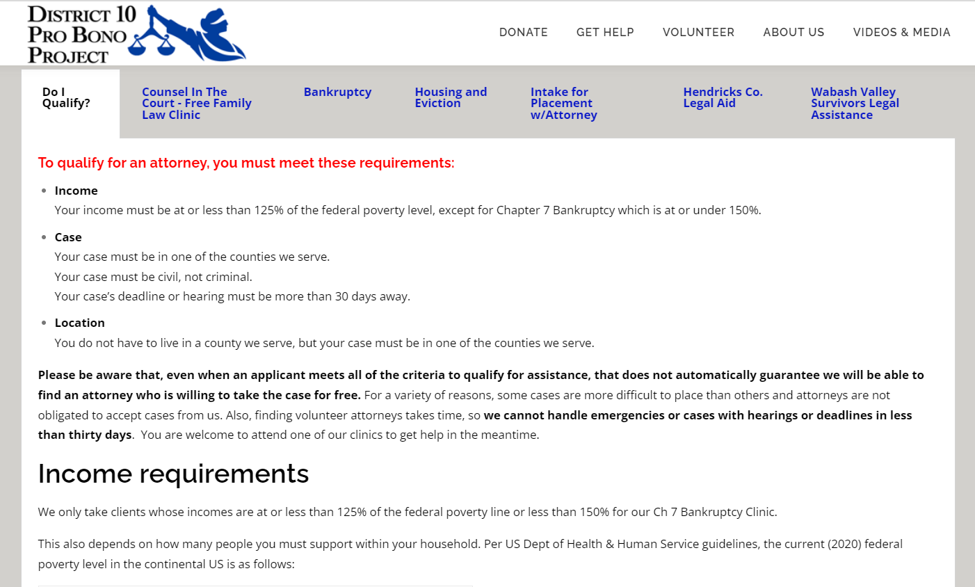
To initiate the redesign journey, our team extensively researched d10probono.com and its competitors. I personally examined the current website's structure, layout, and navigation to pinpoint areas of concern and opportunities for enhancement.
Based on my examination, I unearthed significant insights:
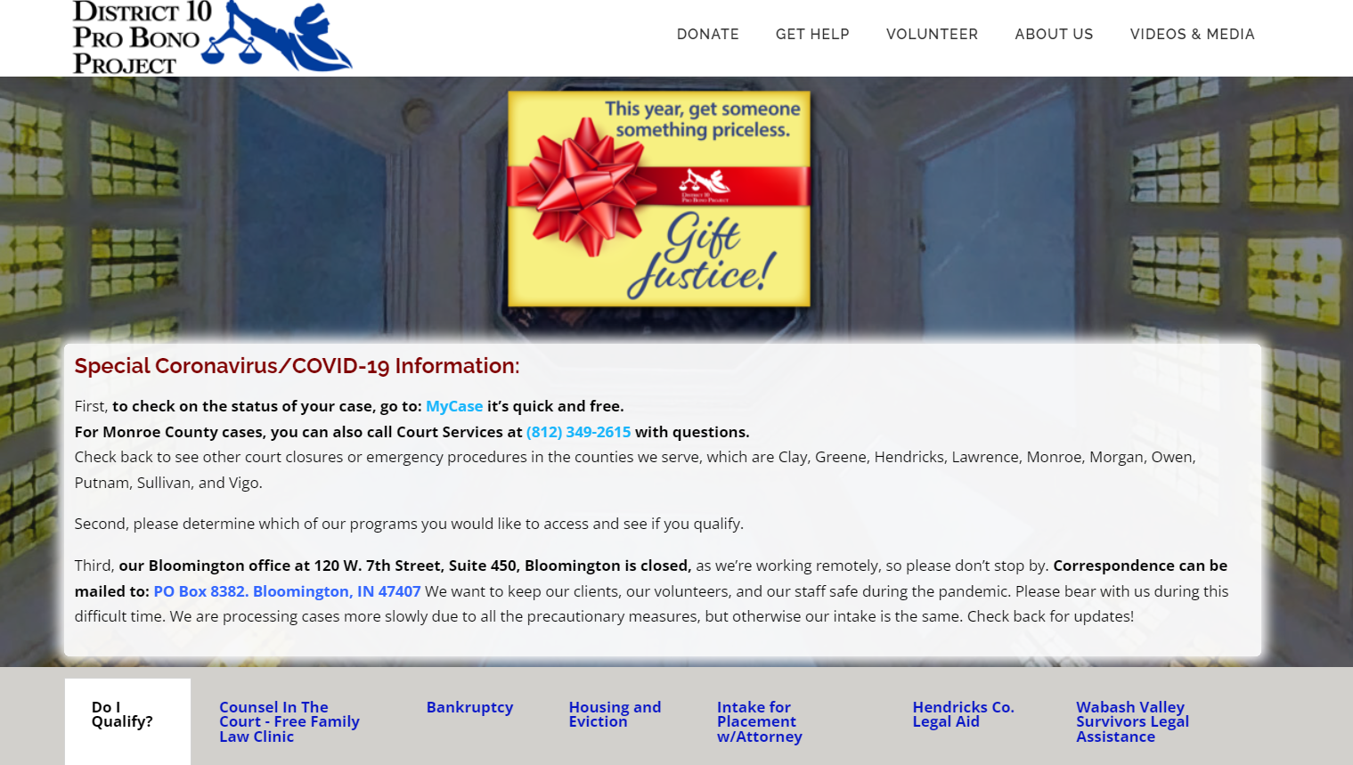
Outdated Design: d10probono.com current visual presentation lacked allure and failed to align with contemporary design standards, creating an impression of a dated and less reliable platform.
Information Overload: The homepage suffered from an excess of information and images, resulting in a cluttered interface that hindered users from focusing on essential content. This visual saturation posed challenges for seamless navigation.
Absence of Focal Point: The congested layout contributed to the absence of a clear focal point, making it challenging for users to identify crucial sections or actions on the page. This lack of hierarchy and visual organization impeded users in understanding where to direct their attention.
Navigation Challenges: The website's navigation proved nonintuitive, complicating users' ability to locate desired information or specific pages, such as search functionalities or donation pages. Additionally, the absence of a dedicated home button on other pages, aside from the logo, made returning to the homepage less straightforward, potentially leading to user frustration and missed opportunities.
Basic Agency Info
Defining the Problem & Goals
Drawing from individual findings within the team, we collaboratively crafted a concise problem statement and established definitive goals for our site redesign project:
How can we redesign the District 10 Pro Bono site to significantly improve the user experience, especially for those seeking justice, ensuring a more effective and user-friendly platform?
Goals:
Elevate Visual Appeal: Develop a contemporary and visually captivating design that fosters trust and assurance, staying in harmony with current design aesthetics.
Refine Information Display: Simplify the presentation of information to minimize cognitive strain, enabling users to swiftly locate pertinent content.
Enhance Layout Precision: Establish a distinct visual hierarchy and orderly layout to direct users' focus, facilitating a cohesive and straightforward browsing experience.
Optimize User Experience: Improve website navigation and the booking process to enhance intuitiveness and user-friendliness, ensuring a seamless and effective user journey.
Site Mapping
Ideation and Competitor Web Analysis
In the ideation phase, we identified various modifications essential for the d10probono.com website:
User-Friendly Layout: Substituting current images with more fitting and relatable visuals to create a user-friendly and visually appealing environment. This aims to facilitate immediate user understanding and convey information concisely.
Engaging Homepage: Revamping the homepage to be more captivating and impactful, thereby increasing user engagement and ensuring easily readable and comprehensible information. Additionally, incorporating a dedicated home button in the navigation for users to conveniently return to the main page.
Enhanced Aesthetics: Elevating the overall visual appeal of the website by integrating contemporary design elements, a visually pleasing color scheme, and appropriate typography. These enhancements are designed to contribute to a more compelling and visually satisfying user experience.
Style Guide
As a team, we collaborated to establish a comprehensive style guide for the redesign of the d10probono.com site, ensuring a cohesive design throughout. Our finalization encompassed the color scheme, typography, and images carefully selected to harmonize with the overarching theme and feel of the website.
Have a look below to see the final style guide:
Final Design
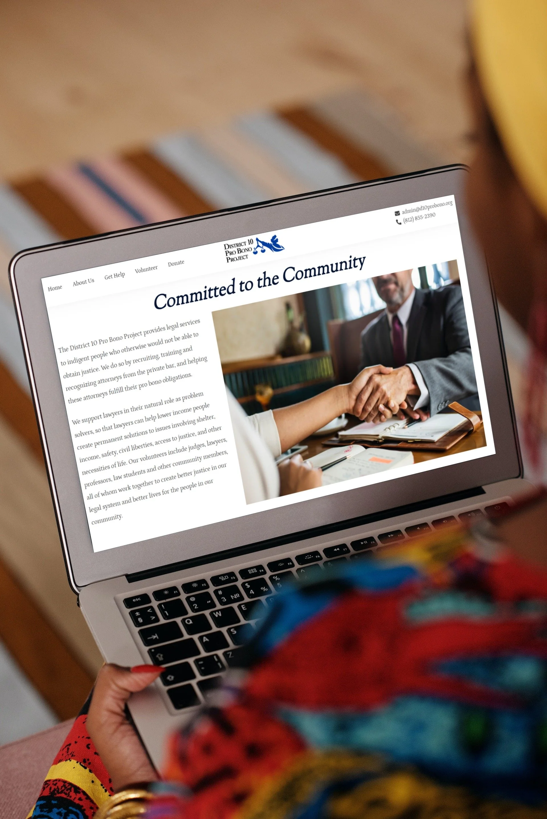
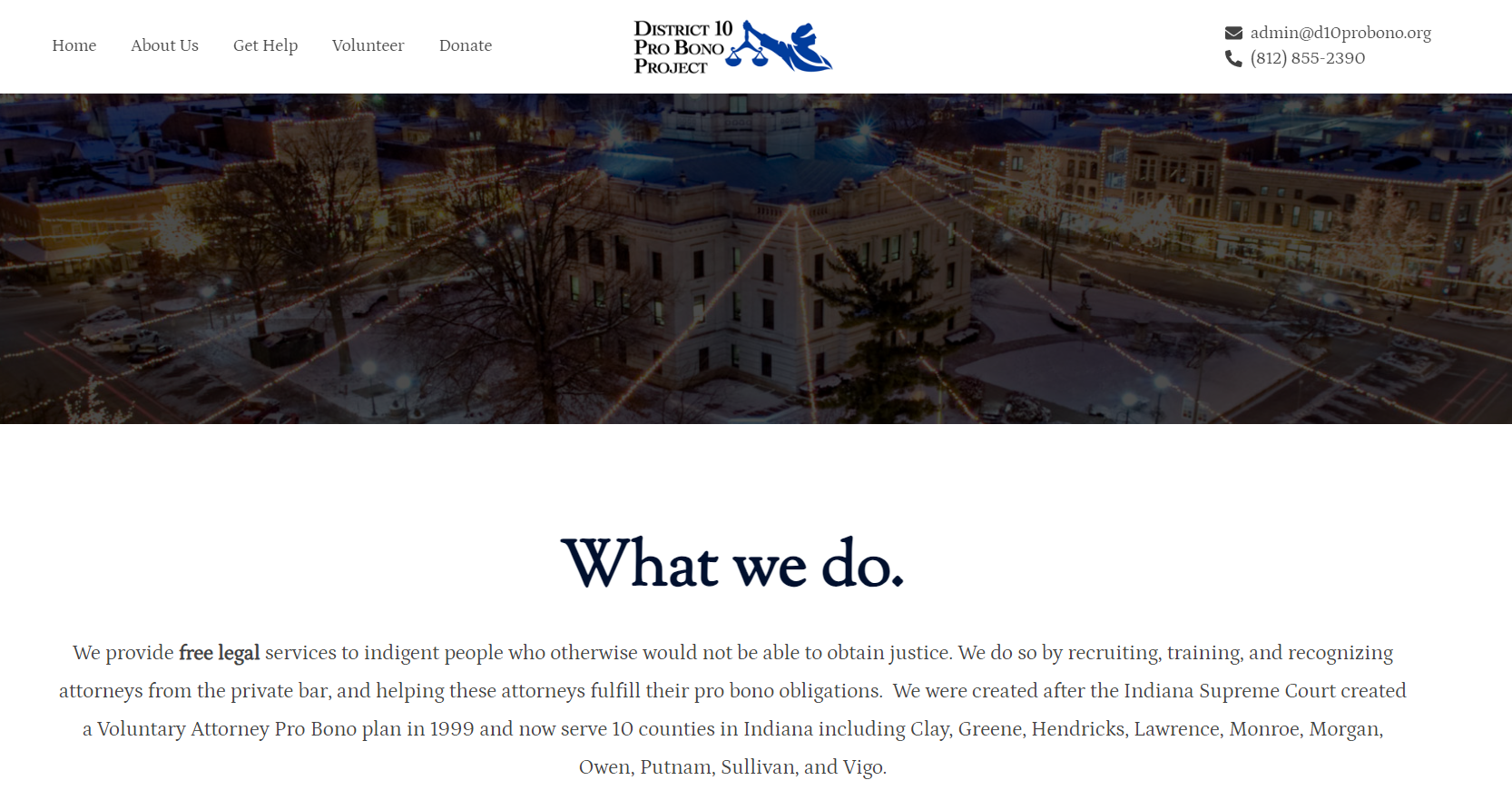
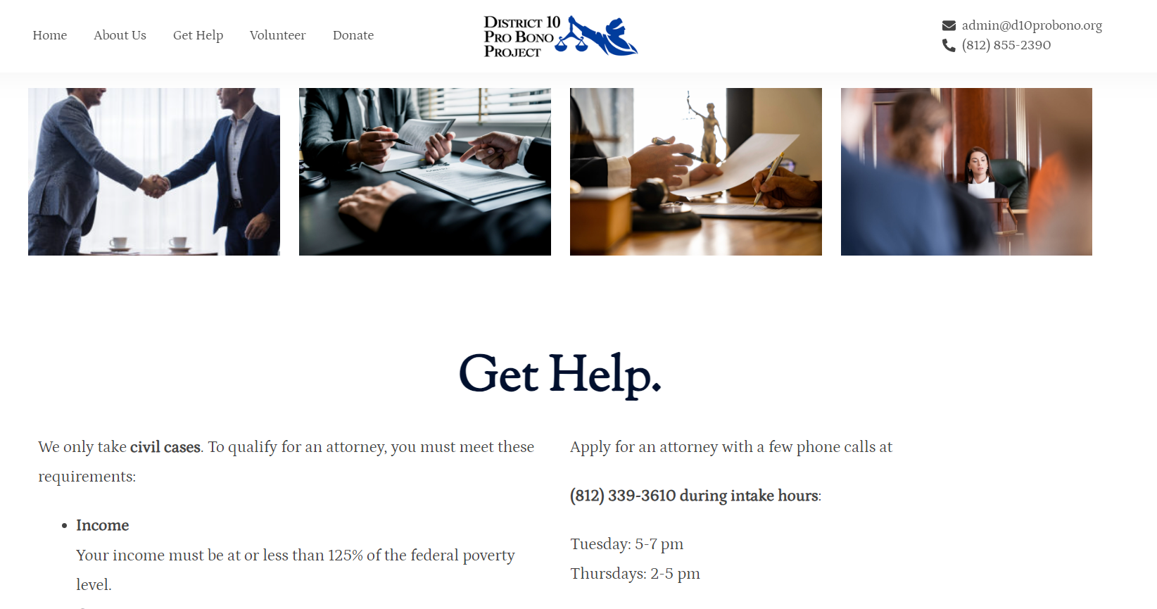
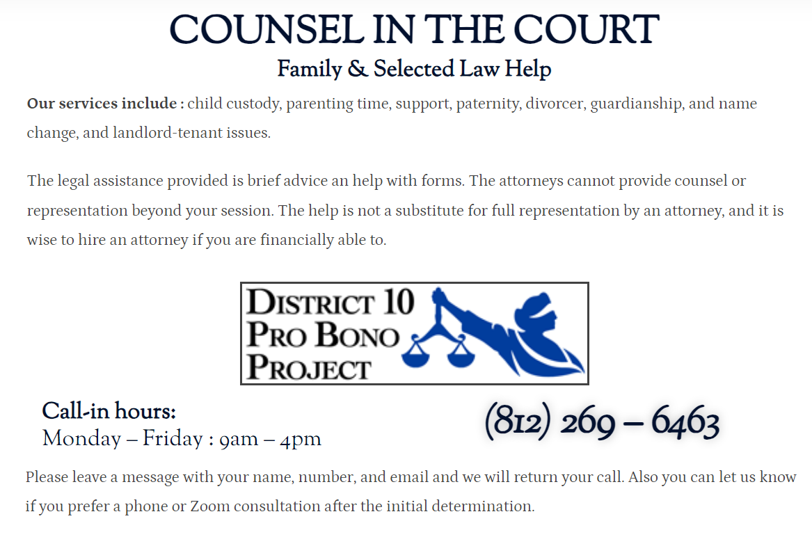
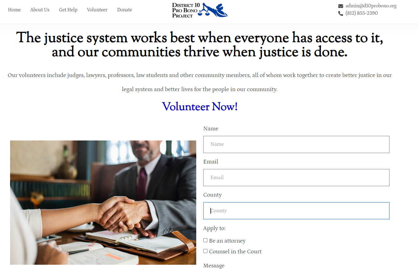
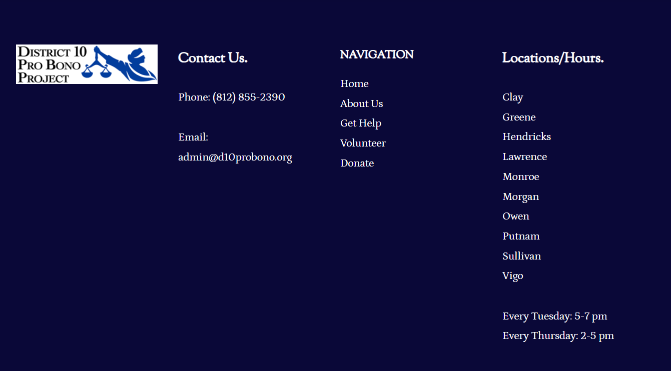
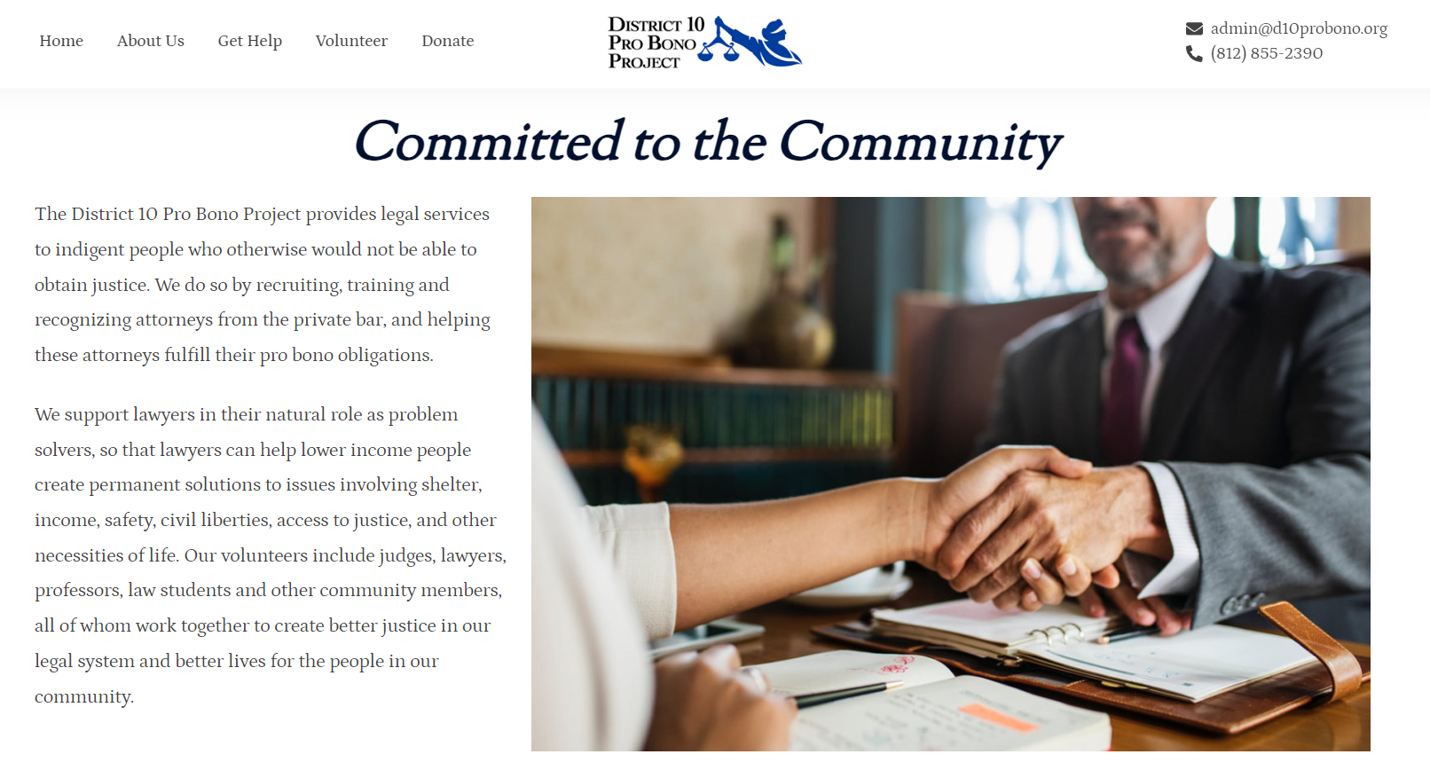
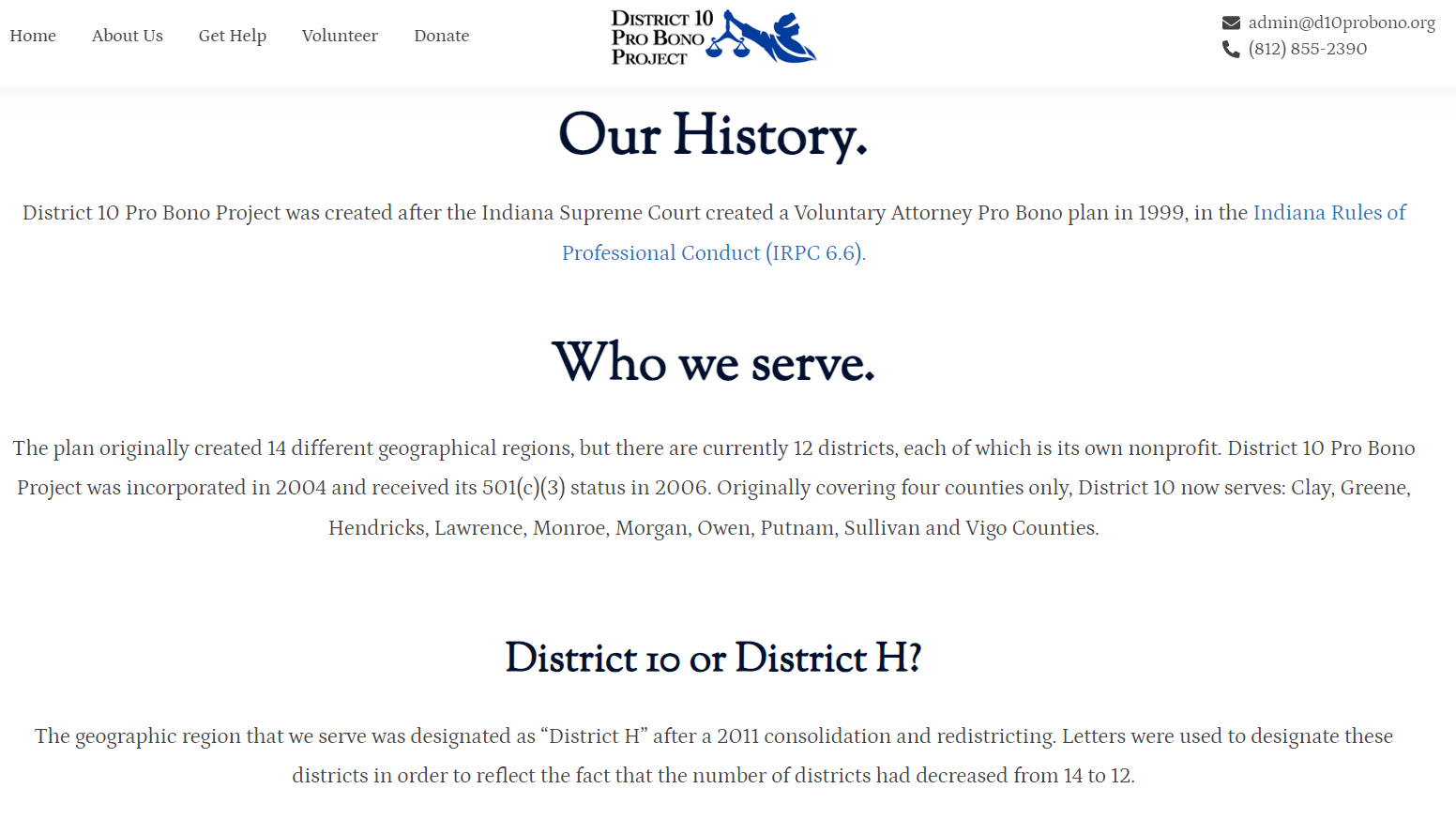
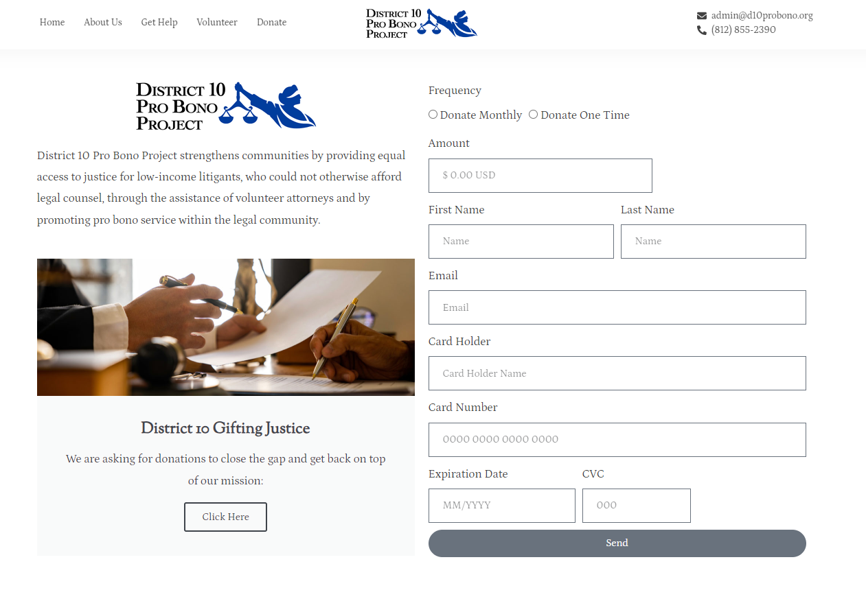
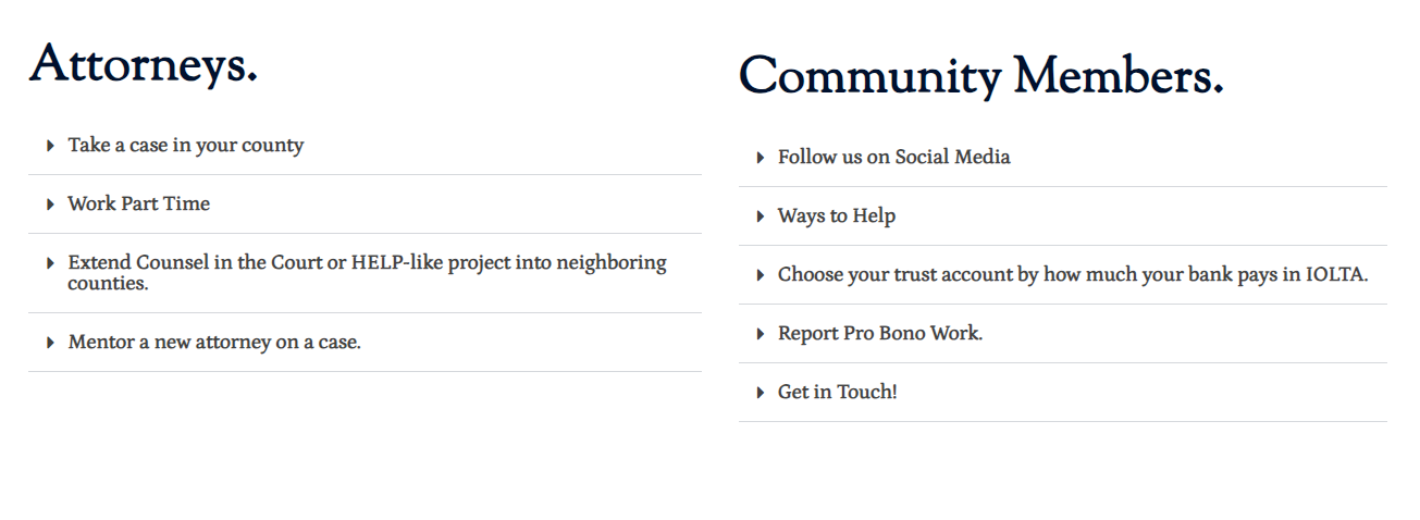
Throughout the design process, I encountered challenges in accommodating all the information from the original site into the redesigned version. My focus was on ensuring readability and avoiding overwhelming visuals, particularly in the redesign of the home page and about us sections. To enhance the user experience, I introduced a new navigation bar featuring a home menu (unlike the previous version) and contact information prominently displayed at the top right for easy communication regarding any questions or concerns. This enhancement not only facilitates smoother navigation but also encourages users to reach out to the agency.
In addition, I incorporated images that vividly depict the organization's purpose, aiding in a better understanding of what District 10 Pro Bono stands for. Consistent text styles, fonts, and headers across pages were implemented for efficient reading. The final versions of the homepage aimed at improving visibility, usability, and overall user experience on d10probono.com.
Have a look at the final redesign:
Home Page
Home Page Continued
Get Help Page
Volunteer Page
About Page
About Page Continued
Donate Page
Footer
Volunteer Page Continued
